
CLEAR DESIGN
Why Paint?
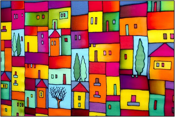
Starting from Soviet times, only faceless gray buildings were built in Russia, and, as per the law of pendulum, today we can see an abundance of colors on our facades. Entire neighborhoods painted in all colors of the rainbow are now appearing. The initial idea was worthy enough – to bring some colors into the gray life of citizens. But note: usually these are the facades of social and economy-class housing that appear many-colored. But the time has come to think what all this is about. About beauty? Functionality? Value added or easy sales?
"Anyway, everything is gray all around, so let at least the buildings be bright," – this is the average response of residents of different cities. But we all know that there are at least 50 shades of gray! As well as thousands of other restrained and rich colors. For many people, "gray" equals to untidy and dirty, it means monotonous architecture and absence of nice-looking shapes. So they are happy when a prefabricated apartment block of 16 floors is at least painted in lilac.
When is color appropriate in architecture?
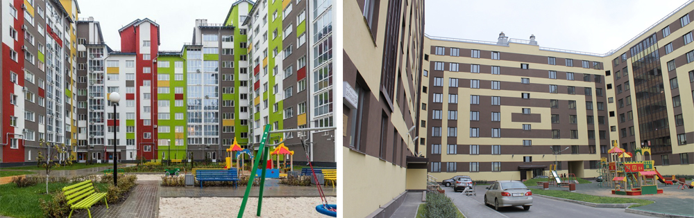
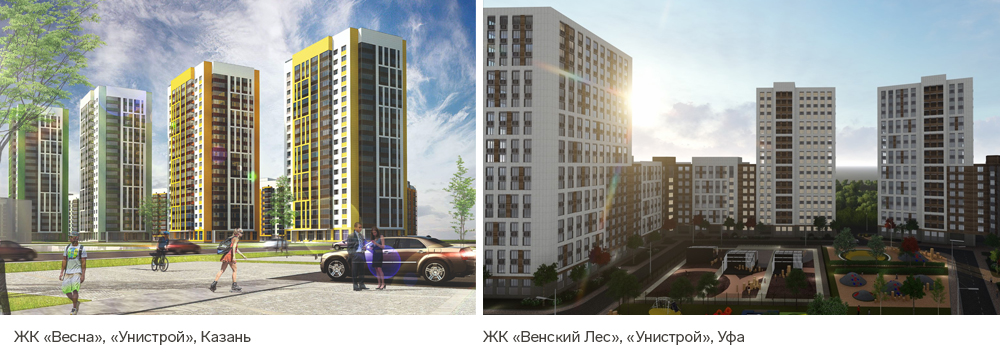
Iskander Yusupov, Deputy CEO of Unistroy (Kazan), believes that the tonality of facades is determined by the marketing strategy of the project, its concept, and its target audience. Bright facades will suit a neighborhood for young families, while projects for a more mature audience need calm colors.
One of the interesting options for using colors is to highlight one building that claims to be a dominant one in the area. In this case, the color not only emphasizes the shape but also hints at a significant function of a facility. This may be a stadium, a museum, an exhibition pavilion. In the environment of a whole neighborhood, a kindergarten or a market can be emphasized.
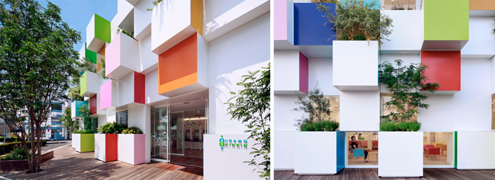
The project of Emmanuelle Moureaux, a French architect, for Sugamo Shinkin Bank (Japan)
Here is a vivid example of how colors emphasize both the shape and the volume. The facade of the building is determined by the rhythmic composition of twelve protruding cubes with greenery. According to the corporate color palette, the prevailing white is boldly diluted with ten other bright colors, which can be traced both on the facade and in the interior of the bank.
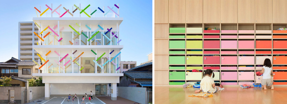
Emmanuelle Moureaux, who has been living in Tokyo since 1996, constantly experiments, creates installations and paints her architecture in all colors of the rainbow.
In the Japanese city of Fukuoka, a building was built in which children can grow in unrestricted freedom, both physical and moral. And this all is thanks to colors. The main element of the kindergarten is the facade which Emmanuelle Moureaux, the chief architect of the project, calls the "colorful grove".
Like it or not, but colors are indispensable in northern regions
We admire the bright Scandinavian houses. Indeed, they are multi-colored, but still, how tasteful they are! This is primarily because of the fact that for centuries, the main building material in Sweden, Denmark, and Norway was wood, and a layer of paint just makes it more durable. Red was the most popular among all other colors because red paint was cheaper.
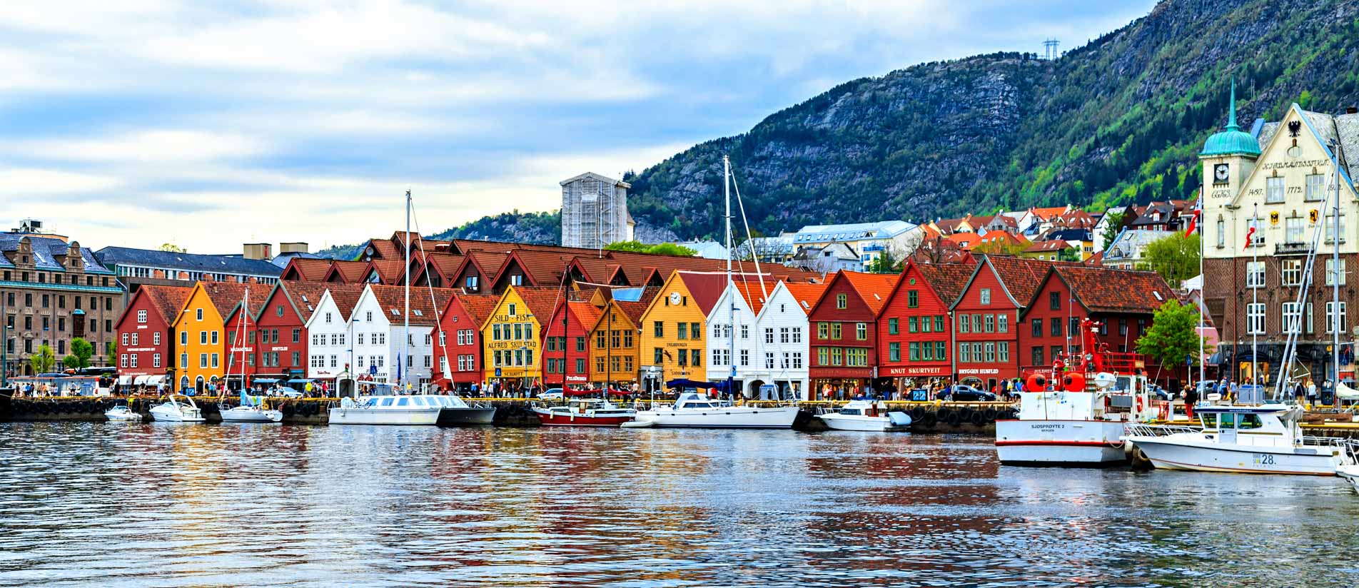
Furthermore, in the coastal towns, bright buildings serve as seamarks for fishermen and seafarers. Indeed, in the regions where winters stretch for many months and the landscapes are monochrome, this is the architecture that helps to fill the lack of bright colors. But note: this is low-rise architecture with historical shapes and rich shades in the local version.
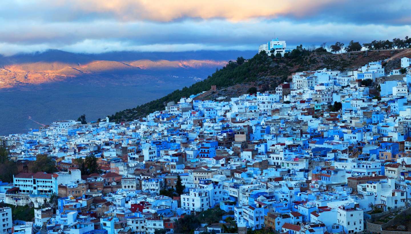
A color sometimes becomes a "signature" of a location
For example, the blue city of Chefchaouen in Morocco: here such design has formed historically.
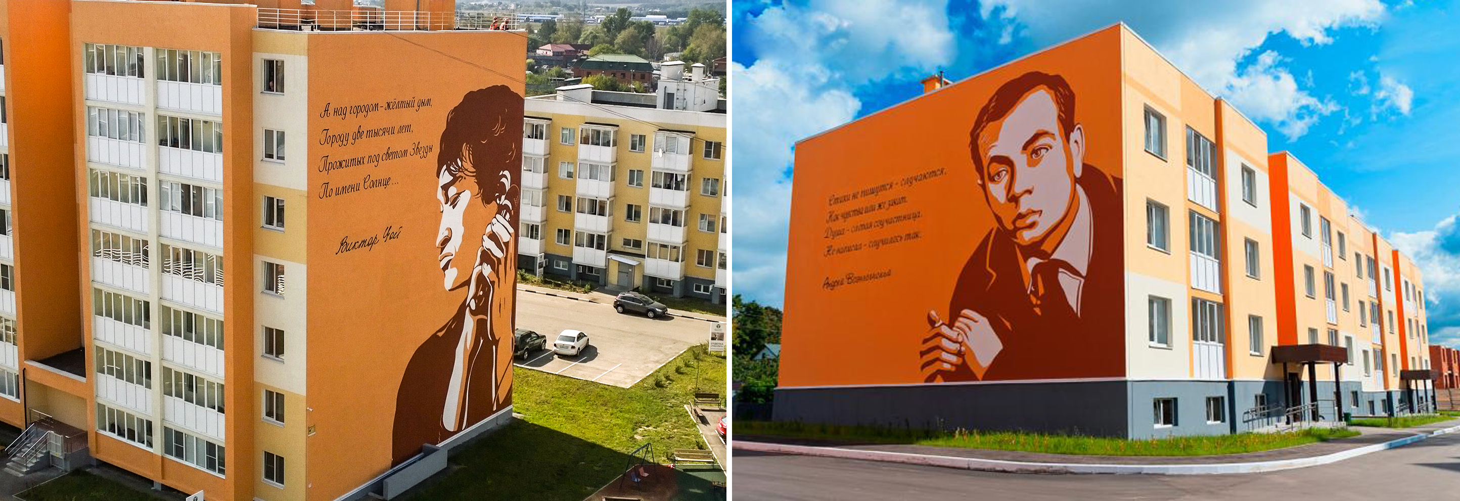
But the colorful Anadyr in the Chukotka is a conscious attempt to make life "more cheerful" and "more colorful". Now imagine this architecture colorless. Is there any?

A color can also become a navigation element
"I live in the red house" – "And I live in the green one." Or even more poetic: The "House of Pushkin" is across the street from the "House of Akhmatova." It is certainly convenient for the guests of the neighborhood, but I'm still for more elegant means of navigation.
Architect Nikita Malikov also stands for the careful use of colors: "Colorful and bright facades themselves are not bad. But they are not always and not everywhere appropriate. Now colors on facades of residential buildings are used as the antipode of "grayness" of typical buildings. But this is often nothing more than a just marketing ploy than a successful architectural solution in the context of a city. If a bright facade looks good in the picture of an advertising brochure, this does not mean at all that it will create the same effect on people passing by after the building will be finished. People feel comfortable when surrounded by calmer colors.
Everything which is bright and motley can only be temporary, like flowers on a spring lawn – this is how it is intended by nature. "Colorful" facades look good only on buildings that are not intended for long-term use: on festival buildings, distantly standing shopping centers, or exhibition halls, rarely – on hotels. As for residential buildings, only some emphasized elements can be bright on them. The more restrained the color range of residential buildings, the more comfortable they will be perceived by the residents."
Does a bright color help sell more expensively?
Let's look at colored facades in terms of sales. Is there any rise in the price of apartments in such a building? According to experts, as for the housing of economy and comfort classes, the bright appearance of a building can accelerate sales, but will not help to sell them at higher prices. In the economy segment, nobody wants to overpay for the facade. On the contrary, in the premium segment, the appearance of the building is of great importance for customers. And also the tastes of such audience are sophisticated, this is why developers are the most restrained about color design in this very class. The shape is primary here, and the color only emphasizes it.
This is what future architects are taught back in universities. According to Timur Abdullaev, Head of IN.FORM Architectural Studio, a shape is, of course, the most powerful among the means of expression, and colors are still additional means. "The shape of buildings determines their proportions and mass, creates details and decorative elements," he notes. "Many of the buildings that have come down to us from past centuries have completely lost their color information, but have saved their shape. Therefore, when they now try to paint the architecture, turning primitive faceless volumes into multi-colored patterns, this is, of course, a kind of cheap substitution – "architectural makeup". This does not mean that there is no place for colors in architecture at all, but the use of active colors should be very neat and appropriate. In addition, in the pursuit of a universal reduction in the cost of finishing the facades, the developers practically stopped working with materials, but besides colors, there is also a texture which gives a unique perception of surfaces: metal, stone, wood, concrete, glass – all this when "clothed" in a shape creates a real, honest architecture."
Полезные письма для девелоперов
Без «воды». Раз в неделю.
