
CLEAR DESIGN

About the company
BI Group is the leader in the real estate market of Kazakhstan. It has been operating since 1995. Today, BI Group is a large diversified group consisting of divisions and departments in various areas of construction, development, and engineering. Since the company was found, it has built over 4.5 million square meters of residential neighborhoods, gated communities, commercial real estate, infrastructure and industrial facilities.
What is an information materials ecosystem for?
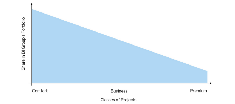
BI Group has over 50 projects in Astana alone, from standard to premium classes, and each has its own unique style. However, it was difficult for clients to identify the developer’s brand in such a diversity, and the company itself had to spend additional resources for creating new visual communications for each project.
We'd got several tasks:
- To systematize visual communications of the BI brand portfolio.
- To develop unique visual characteristics for each class of projects within the portfolio.
- To create flexible solutions that will both streamline visual communications and be convenient and easy to use.
Before proceeding with the design process, we analyzed the portfolio by product categories::
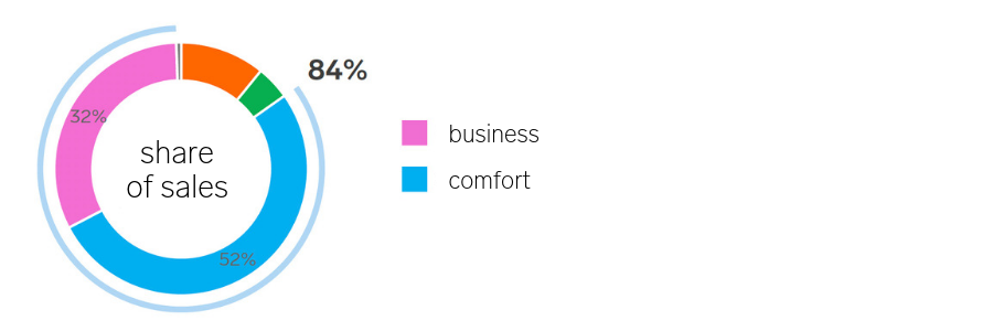
Thus, it became clear that the greater share of sales is formed by projects of the comfort and business classes. It meant that it was necessary to work with these groups in the first place.
Existing visual code analysis
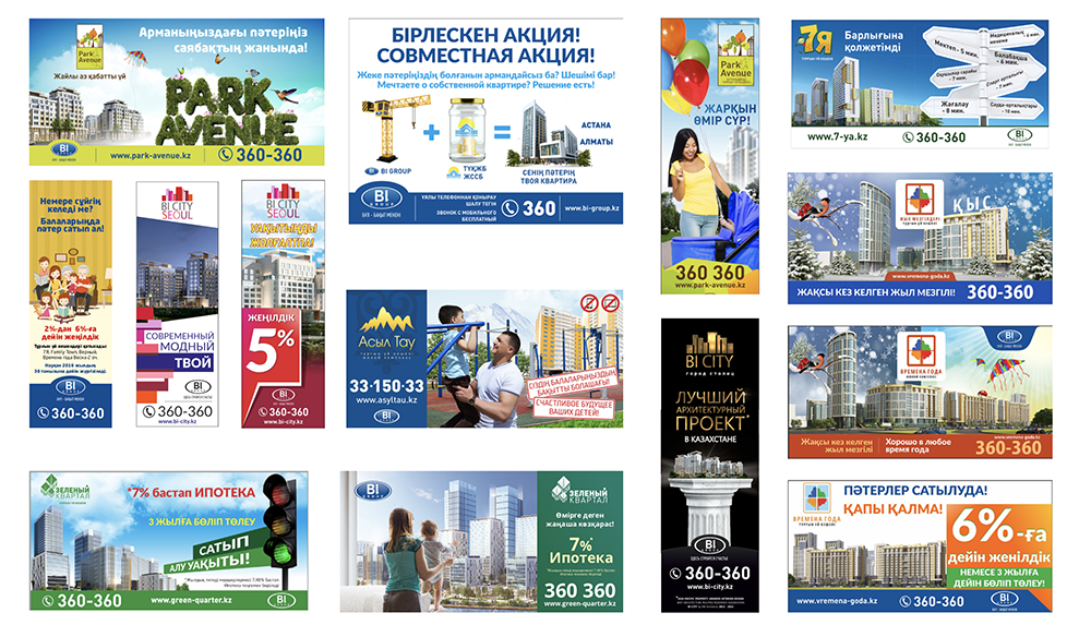
Next, we analyzed the visual communications of projects of the said classes. We got a rather motley picture: as you can see in the picture below, there was no single design code and all project promo materials were designed situationally.
 In each of these target audiences, the influence of the developer’s identity is different. Let me remind that in comfort and standard classes, it is of greater importance for the customer who exactly builds. After all, the characteristics of the projects are mainly about the same in these classes and the audience is defined in advance, provided that the developer is highly recognizable in the market. Projects of premium or deluxe classes are always exclusive, their audience is demanding of particulars, they don't appreciate standardization, the product shall be unique, including in terms of promotion tools design.
What tools can be used to systematize the visual component of projects? Here are 5 basic techniques:
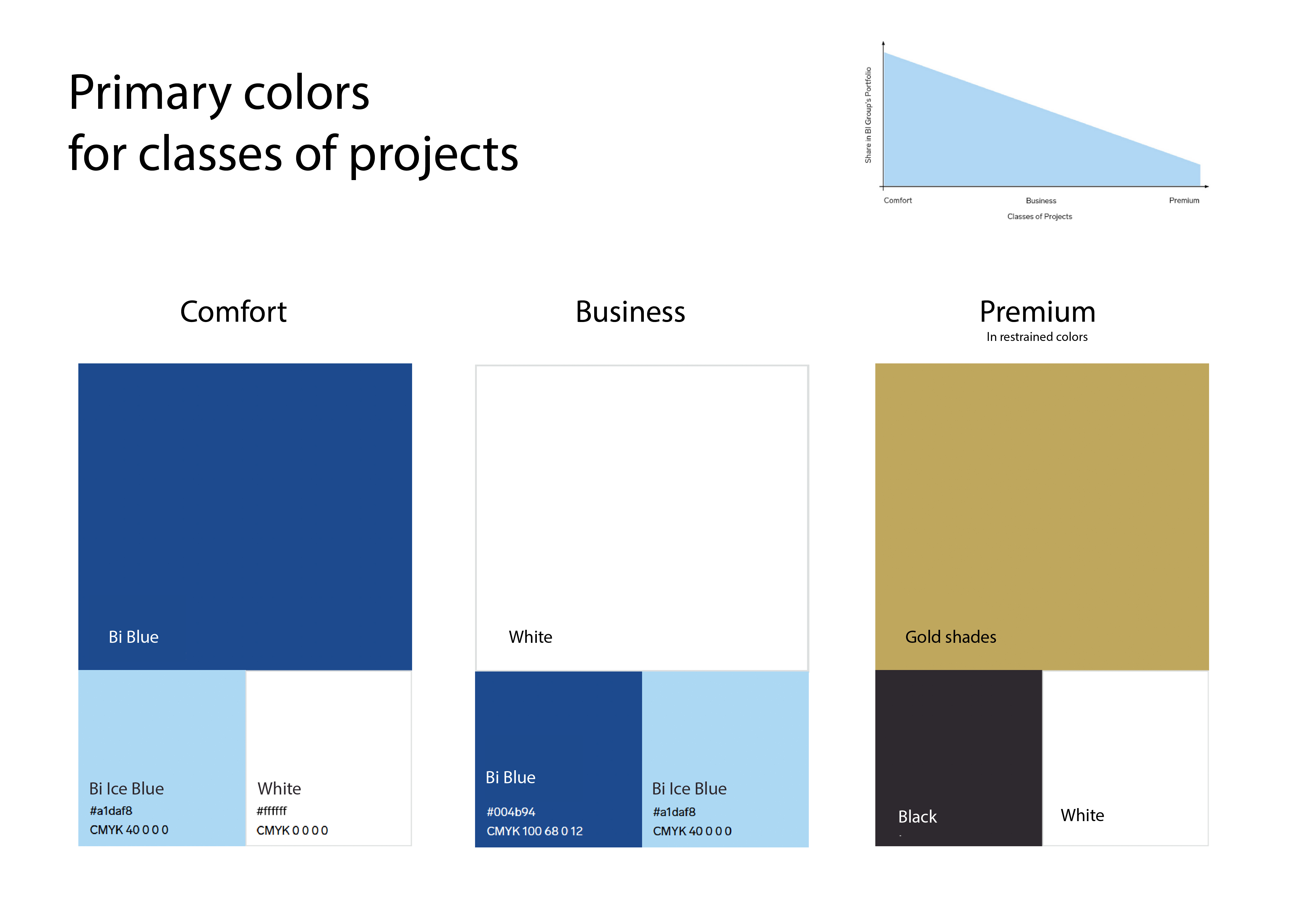
#1 Color
Each class has its own basic palette.
#2 Layout
General principles of layouts, location of the developer’s corporate contacts block, and uniformity in the selection of images.
#3 Fonts
Use of uniform fonts in comfort and business classes materials.
#4 Material
Specifications for choosing materials for information promo products, depending on the class.
#5 Format
Specifications for choosing formats of information promo products, depending on the class.
Practical implementation
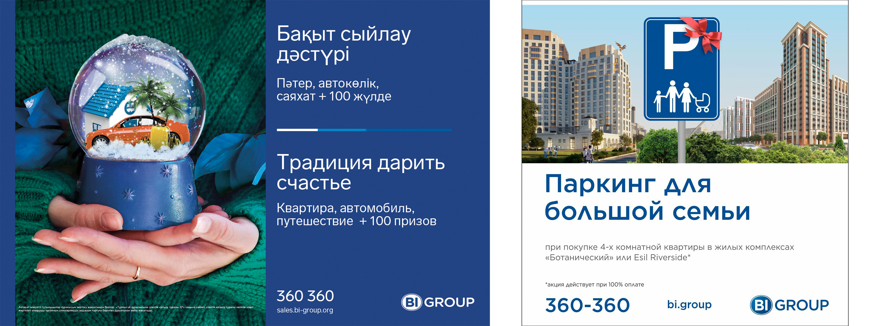
As for the palette, we adjusted it according to the project classes and depending on how brightly the developer’s brand should be perceived in the promotional materials. The result was the following: in comfort class, the BI Group's brand blue color prevails; in business class, it goes to the background, and white becomes the main one. Projects of premium class are designed individually, but always in a noble restrained palette.
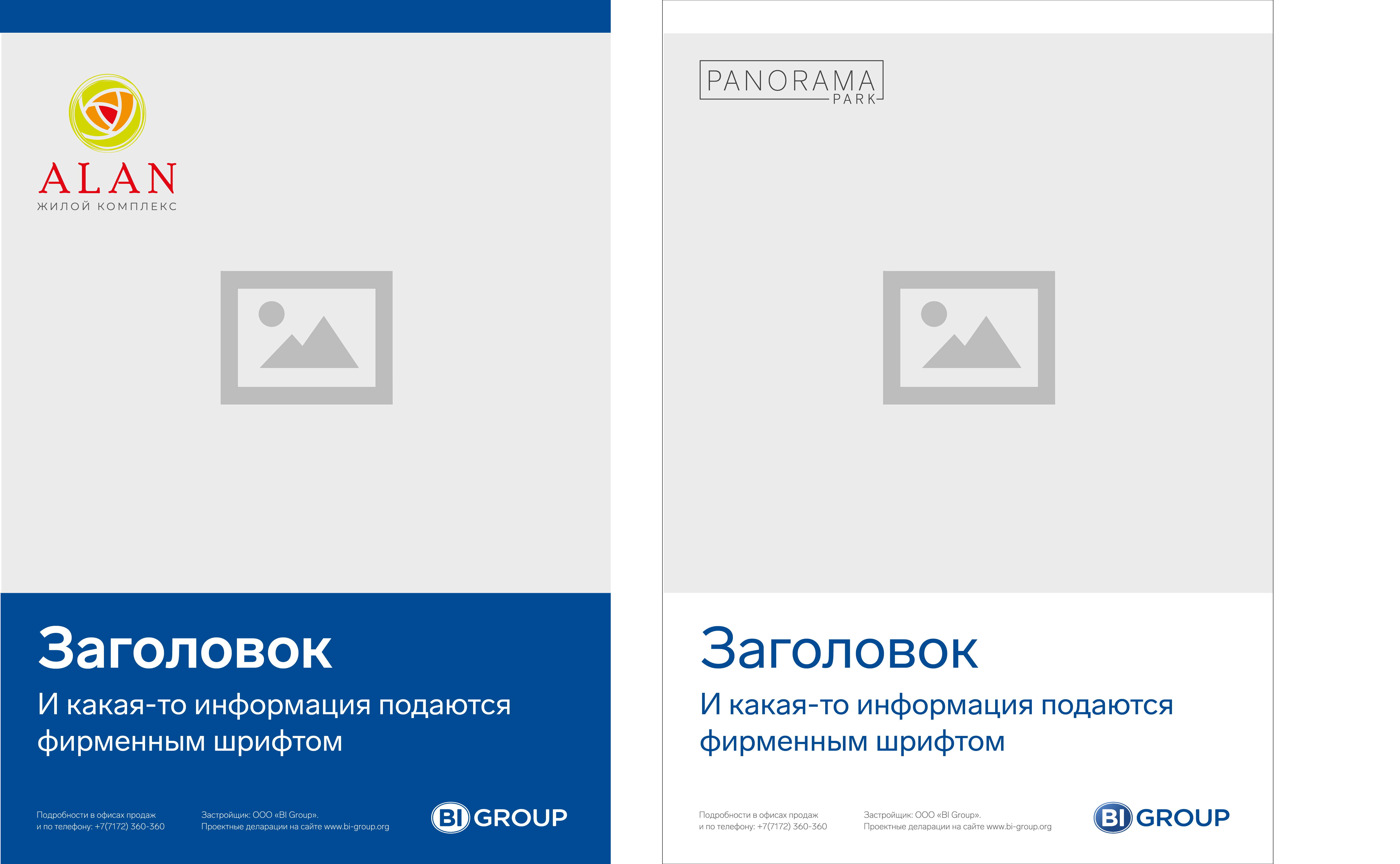
Corporate contacts block and rules for composing an advertising module
We have elaborated a corporate developer's contacts block and rules for composing an advertising module. These rules are the same for both comfort and business classes, with the only difference that the business class has a white contacts block, and the comfort segment has a blue one.

a result, this scheme became a basis for the design of all project brochures. Now, looking at the promo materials rack, it is easy for the customer to identify BI Group and to understand which class a certain project belongs to. Besides brochures, the design studio has elaborated a corporate magazine, a new dweller handbook, leaflets, flyers, and other attributes of the sales manager. We also gave recommendations on paper quality and printing methods. We've worked on the content part as well: we simplified the wording, filled the multipage materials with useful information, prescribed the structure and narrative logic for future projects.

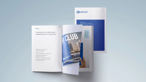
Ecosystem of Information Materials, a book handed over to BI Group, in addition to the practical part contains a materials design guide, which includes:
- visual representation of planning decisions;
- selection of images and the required renders;
- recommendations for photographing people in the residential neighborhood, architecture, and interiors;
- recommendations on the content and structure of materials;
- rules of publications in the materials of partners.
BI Group update

The comprehensive nature of this product is not only in structuring and updating the design. Now each class has its own design code, which means that the customer will be able to quickly determine which category – standard/comfort or business/premium – a certain project belongs to. This makes it easier for the client to make a choice, optimizes the developer’s business processes, makes the developer’s brand stronger – now even the average consumer will understand the scale of all projects.
We recommend a similar ecosystem of information materials to all real estate developers, especially to those having several projects of various classes of housing in their portfolio. Find more details in my video.
