
UNCATEGORIZED, MARKETING WITHOUT BORDERS, CLEAR DESIGN, VISITING CONSTRUCTION SITES

First Things First
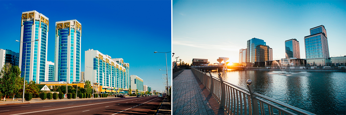
BI Group is a large construction group, the leader in the real estate market of Kazakhstan. In 23 years, it has implemented over 100 residential projects of all levels of comfort.
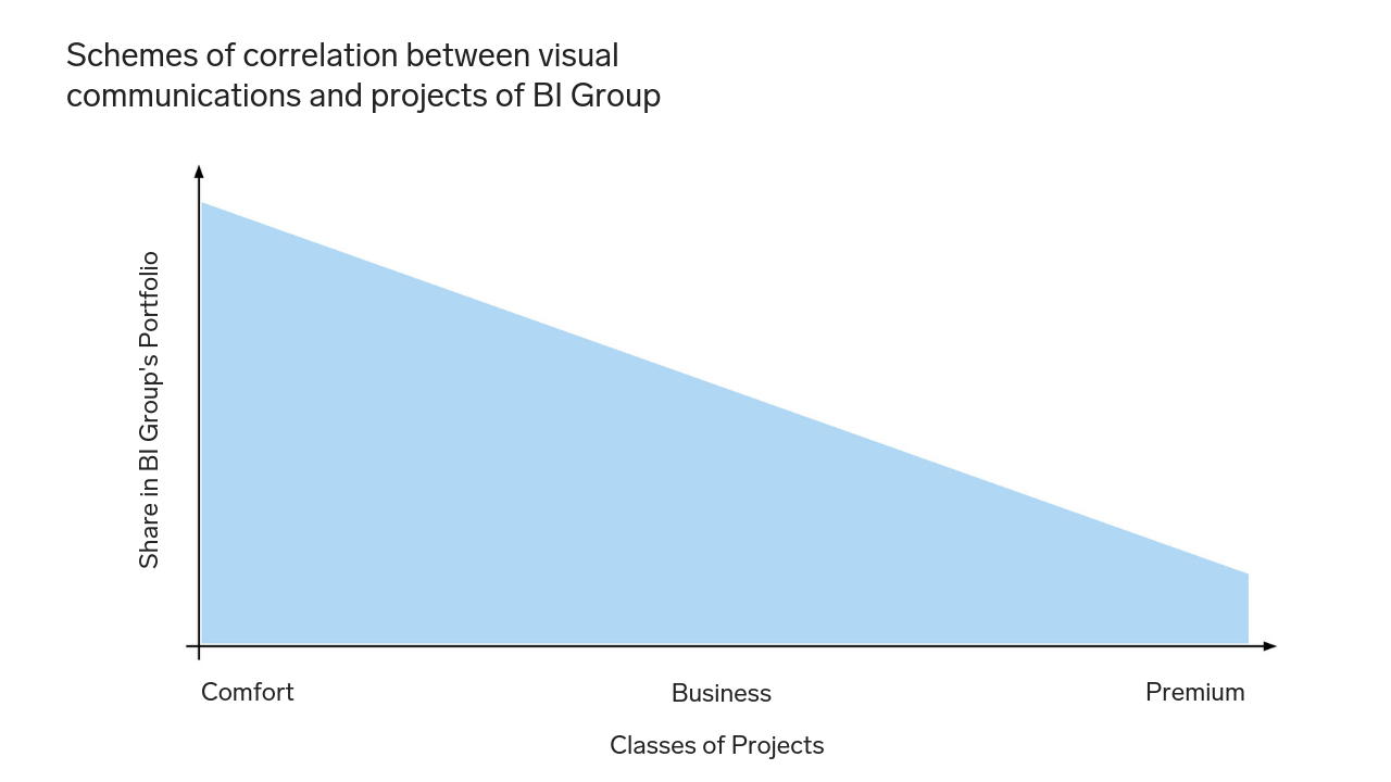
In the middle of last year, we received the request not to just design a construction site appearance – generally speaking, it was not so important what exactly project out of fifty we would work with – the task was much wider: to elaborate a design system to be applied to all projects with ranking by classes. The two most common classes – business and standard/comfort – have two completely different target audiences which require different approaches, including in terms of visual communication. Thus, we graphically highlighted each class, but at the same time, we strengthened the developer’s brand with the consistency of design elements across classes.
# Design Code
The work on the task began with an analysis of the existing style of the company and the identity of all its projects. Speaking of the latter, there were no clear rules in the system of symbols, color scheme, font solutions: each project was manually created with its own brand book. The corporate identity of BI Group was made in blue shades and this color had already been "attributed" to the company in the minds of customers. We were thinking as follows: for clients of the comfort class, it is more important who the developer is, its reputation and experience, therefore we have in a way unified the projects of this class by a single font and the corporate blue color of BI Group.
Customers of business class pay more attention to the characteristics of the product itself. For this class, we have chosen white as the primary color, and the blue has become the additional one. Having agreed on this color scheme, we integrated it into the design of construction sites. Read further about it.
# To Be Different
Having analyzed the urban environment, the format of the competitors' site appearance designs, and taste preferences of the local residents, we decided to follow the opposite tack! If everything is bright, we will make it laconic. If there are pictures everywhere, we will use texts. So little by little, the vision of the future design began to form.
# Two Pilot Projects
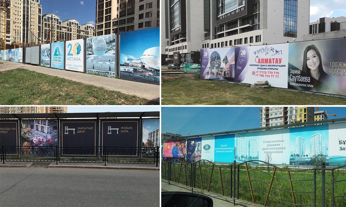
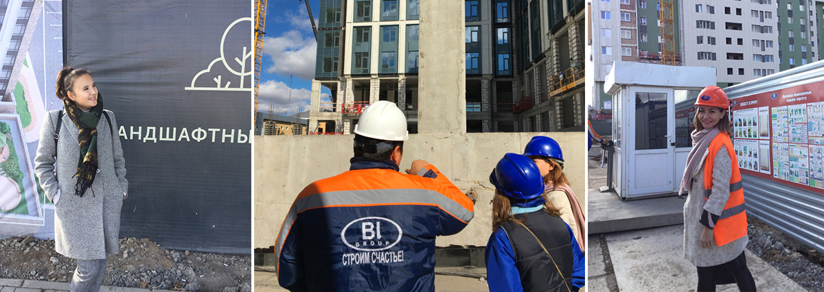
Two projects were chosen as "trailblazers" – one in the business class and one in the comfort class. The team of our Design Center visited the sites and discussed the upcoming work and important elements for further branding together with the marketing specialists of BI Group. We elaborated appearance projects for two construction sites demonstrating a fundamentally new approach – both in design and in the choice of materials. At the same time, we understood that every element should be universal to be suitable for any other site as well.
# Hand in Hand
Having completed the work on the design, our team continued to provide the author's support. We organized Skype meetings several times a week, discussed the ways to implement all the ideas together with contractors, weekly advised designers of BI Group. We flew to Astana several times to help to resolve current issues. From our experience, the most difficult thing for a consistent developer is to take the first step and arrange the first construction site: at this stage, interesting findings and solutions are often significantly simplified or even come to nothing. The marketing team of BI Group was ready for changes, and we really managed to implement a lot even within the first pilot projects.
# The Devil Is in the Detail
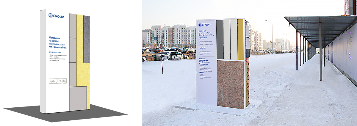
The fence at the business class site was made of alucobond. This material ensures a perfectly flat surface, even if you stretch banner fabric over it. Since the content on the fence is minimal and without pictures, the quality and the material are highly significant.
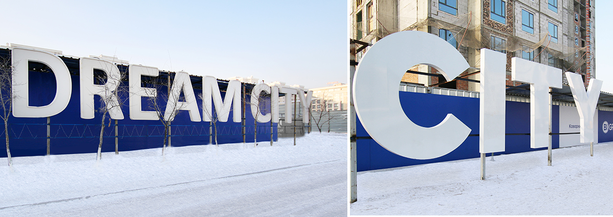
"We were choosing the material taking into account severe weather conditions in Astana (assembly and operation in winter) as well as the possibility to transfer and reuse the components. For example, volumetric letters are made of 10 mm laminated MDF sheets totally coated with paint and varnish and attached to a durable metal frame made from 50 mm corner profiles. The key advantage of these materials is the ability to withstand loads, both of the wind and the effects of human impact. For the fence frame, we used 20 * 40 mm profile pipes with the wall thickness of 2 mm, and as composite boards, we used the material applied for finishing facade parts during construction – 4 mm thick alucobond with excellent performance characteristics.
Rustam Abdullayev, APRINT Group of Companies
Speaking of the letters: installation of the volumetric "Crocus City" letters with the dimensions of 270 * 250 cm and weighing 90 kg each took 3 hours and was performed without the use of special equipment. And the very next day after the installation, the managers of the site asked to dismantle the panels and letters from the fence so that special machinery could pass. Of course, they were later returned back, but the story is instructive: marketing solutions must always be agreed upon with builders.
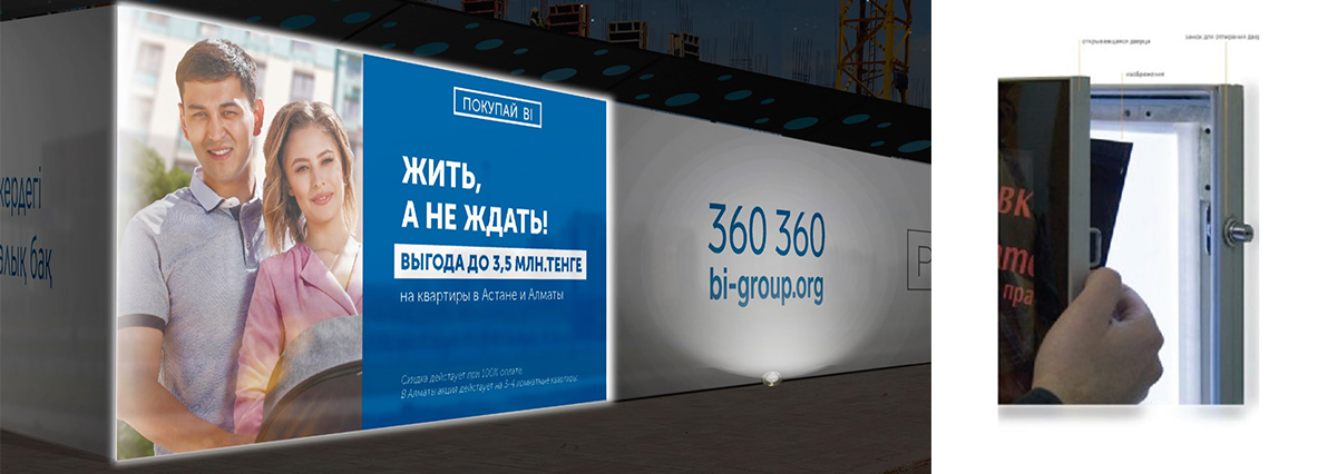
As for interesting solutions: at the business class site, we integrated the lightbox into the fence. The image in it can be easily changed for the current advertising campaign. In the evenings, the box brightly glows.
We proposed to exhibit a techno room element in front of the sales office. Builders together with the contractors created a two-meter wall section fragment with a detailed description of the materials and their characteristics. Such a solution clearly shows the advantages of the site and conveys the company's openness to customers.
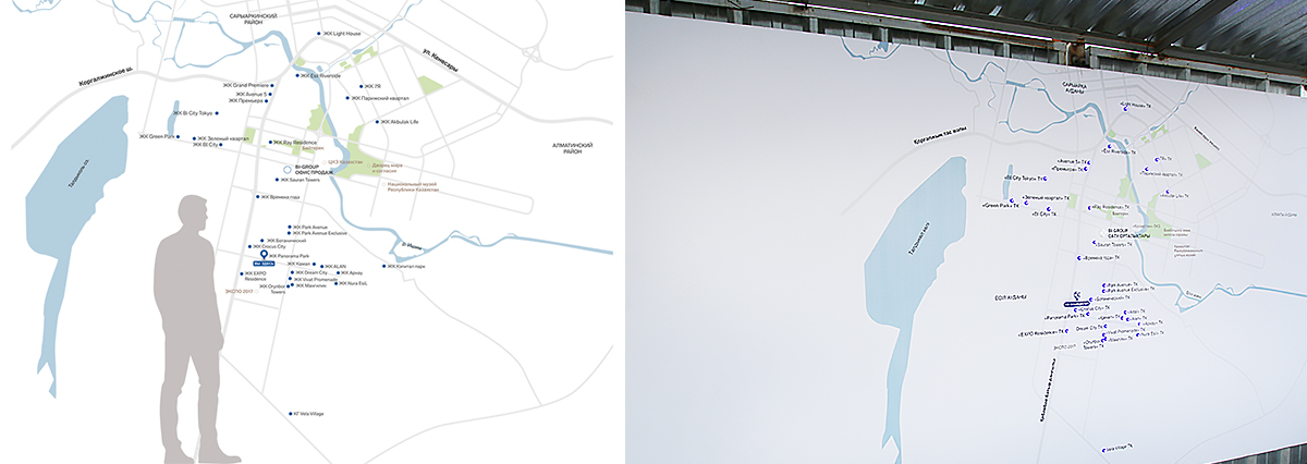
How to emphasize once again that the developer has many projects in the city? We proposed a simple solution: to place a map of the city printed on a 2 * 2 m canvas right on the fence. All sites are marked with separate elements that glow at night and make it look stylish and attract the attention of passersby.
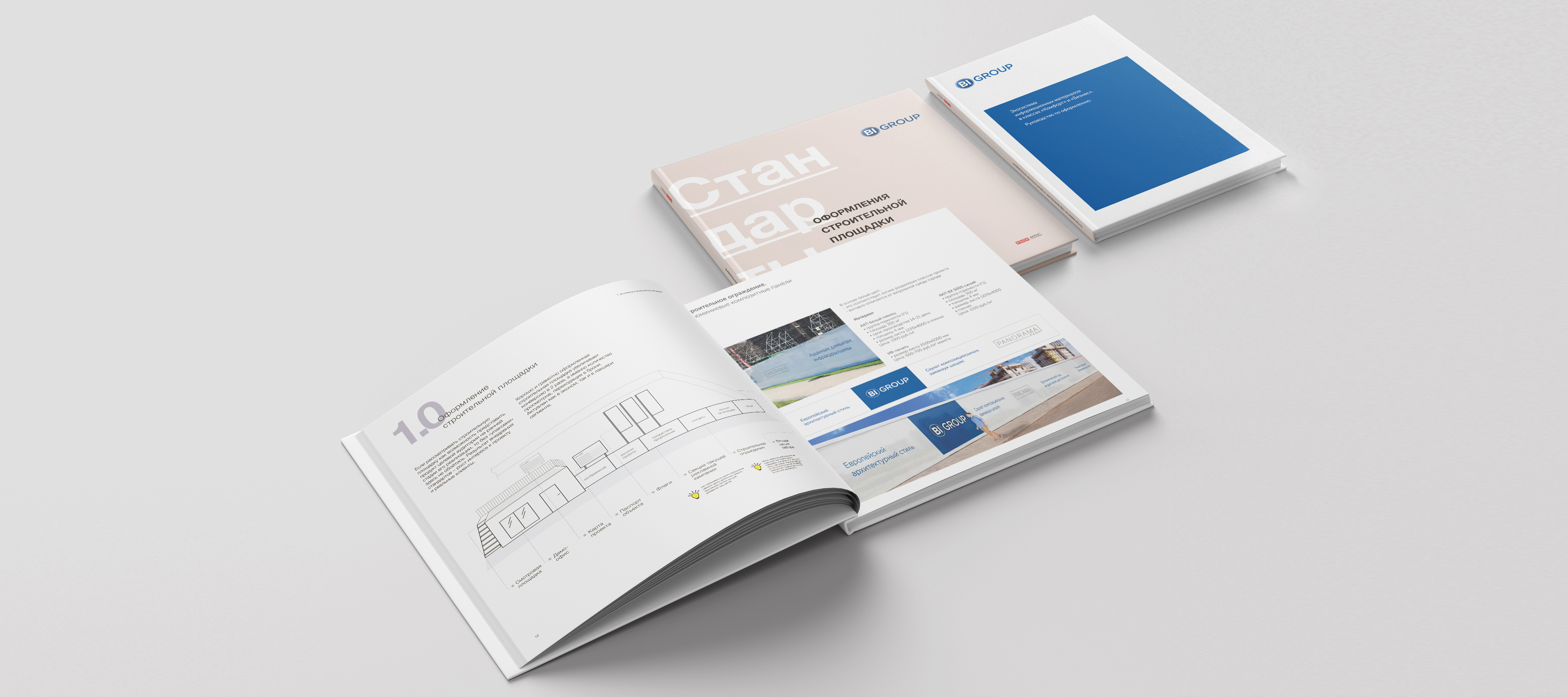
Almost every part of the construction site is still undergoing some qualitative changes as they concern all the elements of the site from the exterior to the demo apartment. We, as authors, have literally been part of the BI Group team for three months assisting in the implementation of the project at all stages. Our experience has shown that the complete design of a new large-scale project such as, for example, Crocus City, takes 3-5 months.
"Even now, we already receive regular calls from other sites asking for some recommendations: how to design a construction site appearance, what design is better to do, which contractors to involve, what is required for it, and so on."
Zarina Ibrayeva, Brand Manager of Advertising and Marketing Department at BI GROUPBI GROUP
# Noblesse Oblige
It was for the first time that construction site appearance standards were implemented not just on the scale of a single project, but on the scale of a whole city and even a country. A fundamentally new approach to the design of sites will set a high bar for the entire construction industry of Kazakhstan.
This is confirmed by the words of Olegzhan Beketayev, Head of Marketing Department of BI Group: "Large real estate developers need standards for all business processes, from construction to marketing. This is why the construction site appearance design is not a one-off experiment, but a standard which we're going to apply to all our projects. Cleanliness at the construction site, an organized demo path, comfortable conditions for the demonstration of apartments – all these bear evidence of the company's attention to its buyers and guests. At the same time, the clients can see our real level in construction "without fences" since we have nothing to hide from them. It is important for a market leader to be in trend, to meet modern requirements, to introduce innovative approaches, and to generally improve the culture of construction.
